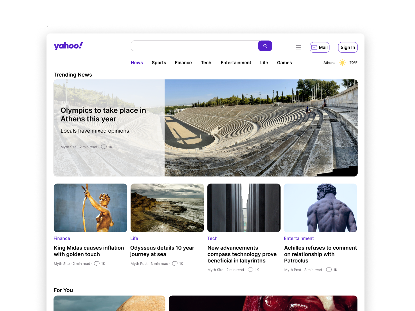
Role UX/UI Designer, Researcher, Illustrator
Team Size 1 Person
Timeline 8 Weeks
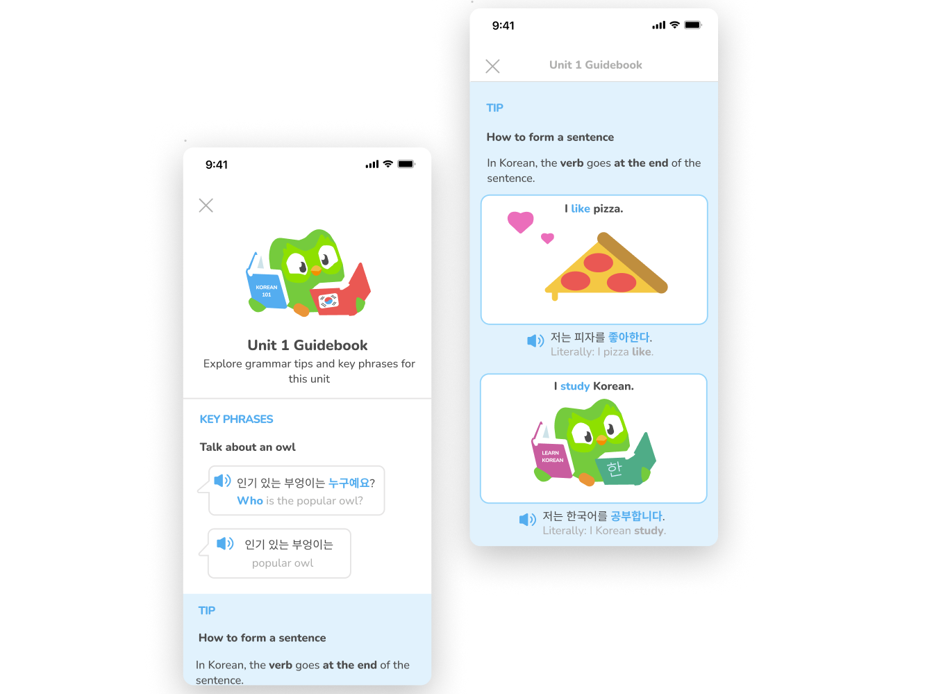
Before & After
Before: Only correct answer is shown without much context
Overview
Duolingo is a language learning app that uses short, game-like lessons so users can practice speaking, reading, writing, vocabulary, and grammar.
Problem Statement
Duolingo does not offer explanations with their answers/translations. By offering an explanation after a user answers incorrectly, users could understand the curriculum and the language better.
Proto-Persona
User Flow
Research
I conducted two rounds of usability tests. Each round had 5 participants. A participant qualified for the usability test if they have tried to learn a language or if they played mobile games.
Two participants were found after guerrilla testing at my local mall.
Three participants were found on Respondent, a remote usability testing website.
Four participants were people I knew personally, so they were tested in person.
Design Process
The first prototype is to gauge whether explanations help users improve their understanding of the correct answer.
I chose Korean as the test language because it is a fairly uncommon language, so participants would not have any background knowledge to help them.
Design System
It was essential to replicate Duolingo's Design System and expand upon it seamlessly in order for the design to be credible.
First Prototype
“I have no idea what I’m doing, so the explanation helps.” - Participant 2
All of the participants said the explanations were helpful for gaining some clarity about the lesson.
The next steps were adding more content to the lesson, so users aren't relying solely on one explanation.
After the first round of usability testing the main takeaways were:
1. Add word to word translations to ease users in
2. Include more color and illustrations to engage users
3. The explanation will remain unchanged for now, because it was well received
Updated Prototype
All the participants mentioned wanting built-in lesson reinforcement, so that they could retain the information better (i.e including a summary, repetition, more activities etc…).
After the second round of usability testing, here are the findings:
1. Modify the lesson to include more opportunities to get a right or wrong answer, so users can encounter multiple explanations.
2. Add exercises that are similar to one another in order to take advantage of repetitive learning/memorization.
2. Add exercises that are similar to one another in order to take advantage of repetitive learning/memorization.
3. Visual explanations such as diagrams were effective, but the lack of pronunciations may have detracted from lesson retention.
Final Prototype
In the future, I'd like to iterate on the diagram format to see if I can find an even more useful method.
I'd also like to add pronunciations done by native speakers, so users can practice their own pronunciation and/or practice recognizing a spoken word.
Lessons
Repetition is imperative for learning. The lesson kept expanding, because participants needed reinforcement in order to retain anything. Participants often said seeing a foreign language for the first time made them feel uneasy. Repeated exposure to a concept allows users to feel more comfortable and receptive.
It was also useful for the participants to be exposed to the same concept in different contexts. It allows for implicit learning rather than explicit learning. For example, in the lesson I refer to "an owl". If I then refer to "a popular owl", users understand adjectives go before the noun in this language.


